

Greggs Bakery Rebranding
I decided to go down a different route than the usual branding projects I usually do, where I created something from scratch. Here I opted to instead redevelop an existing brand called Greggs.
Why I chose Greggs? Simple, it is the largest UK bakery chain, and despite it being two different food markets it has more stores than McDonald's in the UK. The original logo itself has been iconic, but the presentation is very similar to other bakeries in the market, where it contains a modern appearance with the simple font. To make the logo stand out from it's competitors, the goal of this project is to reconnect the brand back to it's roots, by keeping it personal for the nation and also have it embody the nature, whilst retaining the relevancy of a bakery.
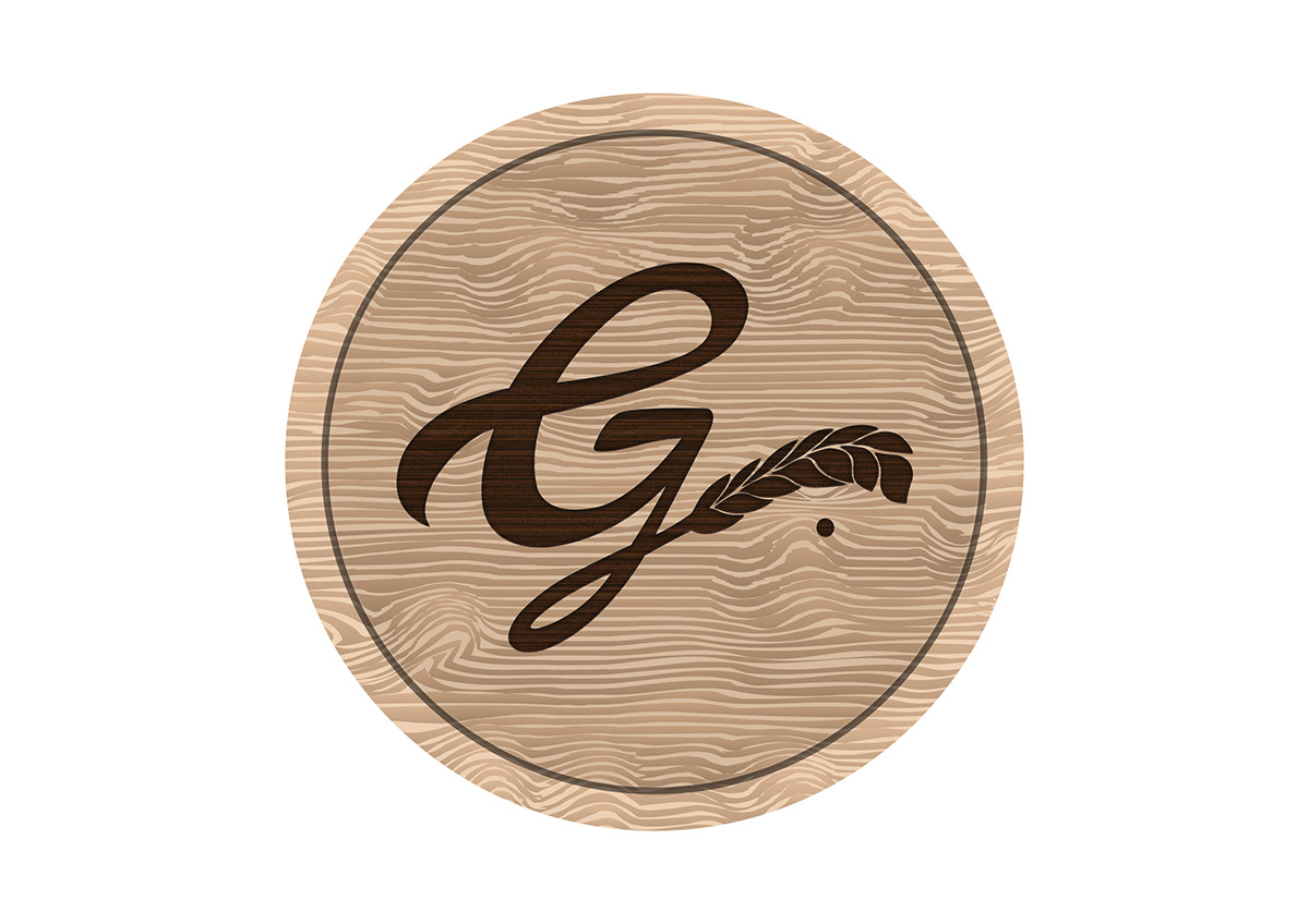
The Logo Design:
I went for a more vintage look in terms of typography as well as the colour palette. I studied the earlier logos for Greggs, they definitely had it's simplicity in terms of font and for the logo itself. To keep that theme consistent, I decided to just use the letter 'G' to represent the brand. I did not want to stylize all the letters as that would probably be too overdone. I tried to stay true to it's roots and not make it too modernized when reaching the final design. The decision was more of a historical reflection of the brand, so I aimed to centralize the style around the 1950s period. The typography is done in a signature style sign off, in a case of 'leaving a mark', hence the dot.
Other Designs:
I did a few mock ups of the packaging design. I wanted the bakery to have that 'classic' feel as well as maintaining the high street appearance to it.


